House2Home
Overview
House2Home was a modified GV design sprint challenge
Role
UX Designer (Sketching, Wireframing, Prototyping)
Tools
Adobe XD
Duration
5 Days

Challenge Brief
House2Home is an e-commerce website selling home decor items and accessories. The most popular items on their site are prints, posters, photos, lighting, and small accessories/pieces.
Users
New homeowners/renters (homes+apartments)
Constraints
Website, desktop screen
Products should be between $10-$15, no big furniture/appliances
Problem
Before decorating a space, users will seek inspiration, but will get overwhelmed because they’re not entirely sure what products to choose from. Users typically know the look and feel they want (style/aesthetic), but are uncertain of how to achieve it within their budget. They’re often hesitant to commit to any sort of purchase(s) before having visualized the potential products in their own home first.
User Research
I was given research that had already been conducted. I started synthesizing the information to grasp a better understanding of the problem space and users’ needs and paint points.
Here are some findings:
Users know the look and feel they want, but don’t know how to achieve it
Users want to maximize style while staying within their budget (the look for less)
Users want to view how decor (multiple items) would look like in their own home before purchasing
Users want a quick way to search for products that match their style
Users sometimes feel overwhelmed when shopping for decor
“I would like someone who knows my taste, find items, and make my style come to life.”
“I know what I like, but I don’t know how items will look in the context of my own home.”


Solution
A feature that would allow users to gather inspiration, collect the items they wish to preview in their own home before purchasing, and enable users to upload an image of their own space to visualize what pieces best compliment their room/home.
Before I came to this solution, I raised some HMW questions to tackle the problem space and identify different angles to design an experience that targets each major pain point.
HMW help users envision products in their own home
HMW help users style their homes with products that give them the look and feel they want within budget
HMW help users prioritize items when considering budget
How I came to that conclusion
Idea Mapping
I came up with several solutions, but drawing from a user journey really helped me put things into perspective. It was easy to break down the problem in a chronological order, which kept the process simplistic.
A journey would look as follows:
User finds a style they like
User find items that go with that style
User gets product details (price, dimensions, etc.)
User prioritizes the items they prefer most
User envisions products in own space
Lightning Demo
Through competitive analysis, I was able to review 3 products and services that were similar to my application.
Ikea: One of the most well known furniture stores on the market. I personally love their minimalistic style which is reflected in their interface.
Features: room planner, information architecture
Pinterest: It’s used to draw inspiration; a great way for users to explore and discover new styles and aesthetics.
Features: easy grid layout, categorized styles
Like To Know: This product allows users to post photos of their own belongings and tag items (clothes, furniture, etc.) to reveal where to purchase products from (ex. original retailer).
Features: product details on where to buy, how to locate, and pricing
Sketches
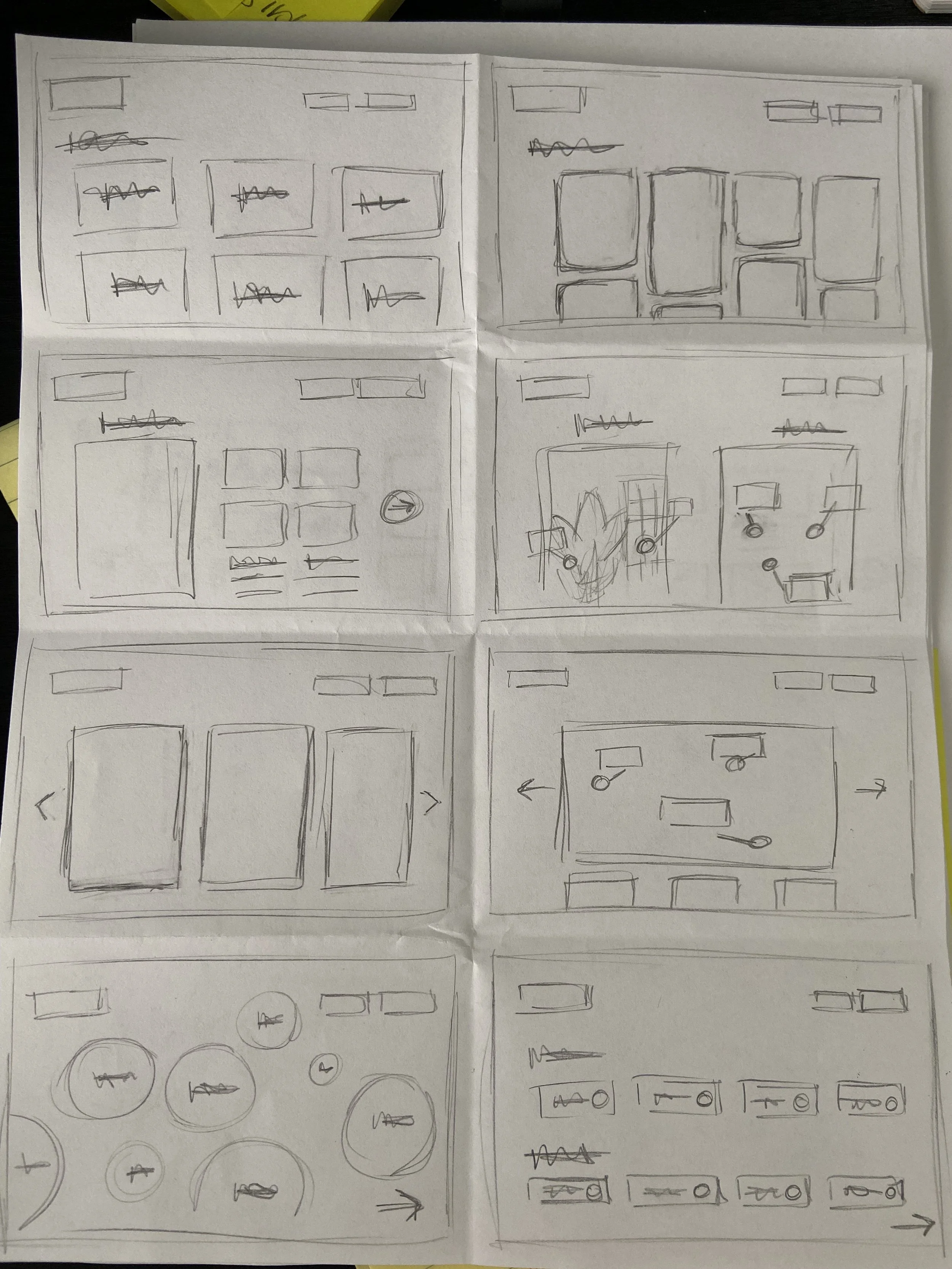
Crazy 8’s
For this exercise, I chose to focus on sketching the first step in the user’s journey, which is “selecting a style”.
Before heading into storyboarding, I was able to distill the 5 step process I created earlier from idea mapping into potential design solutions with actionable screens.
3 step process
Gather inspo
Select a categorized style
Select a staged room that features a range of products
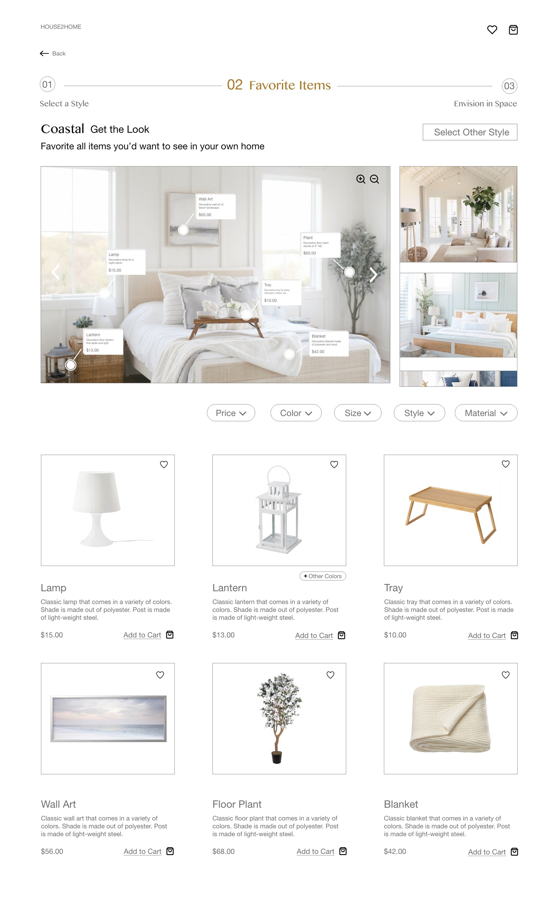
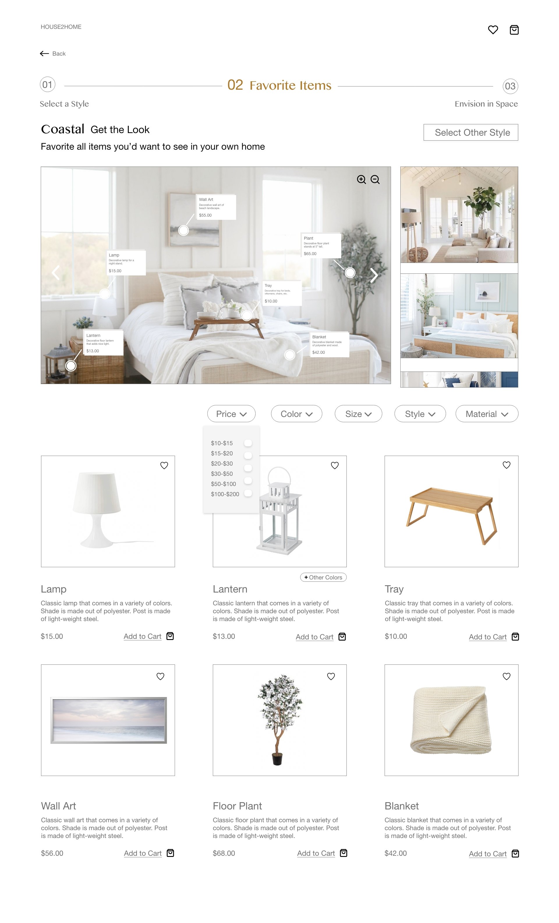
Product details will be listed accordinglySelect items you like
Filter sorting (price, size, style, material, etc.)
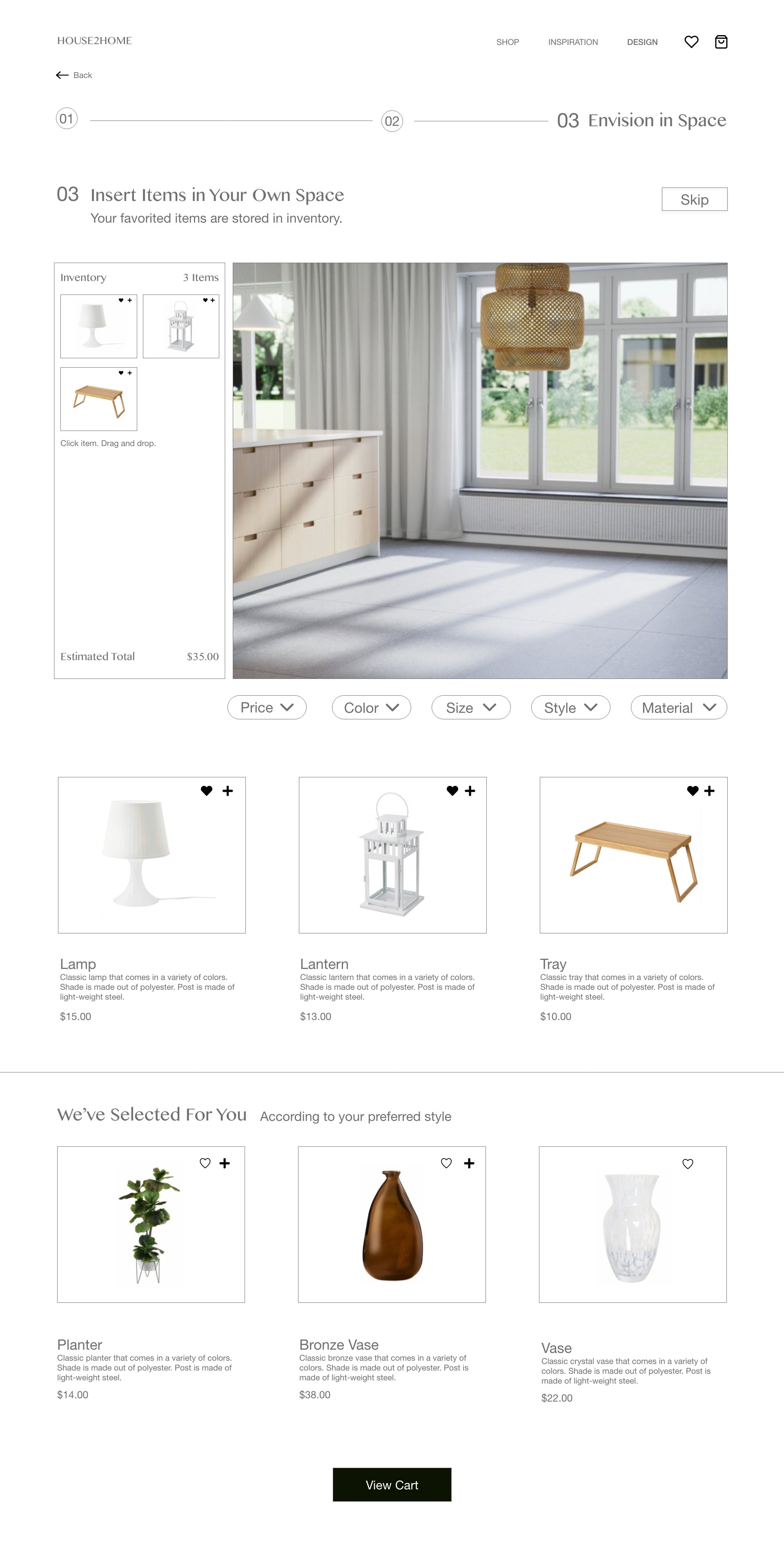
Favorite or add item to cart for further purchaseEnvision in your own space
Items that were favorited are stored in inventory
Upload photo of room(s)
Insert favorited item into virtual design room for visualization before purchasing
Storyboarding
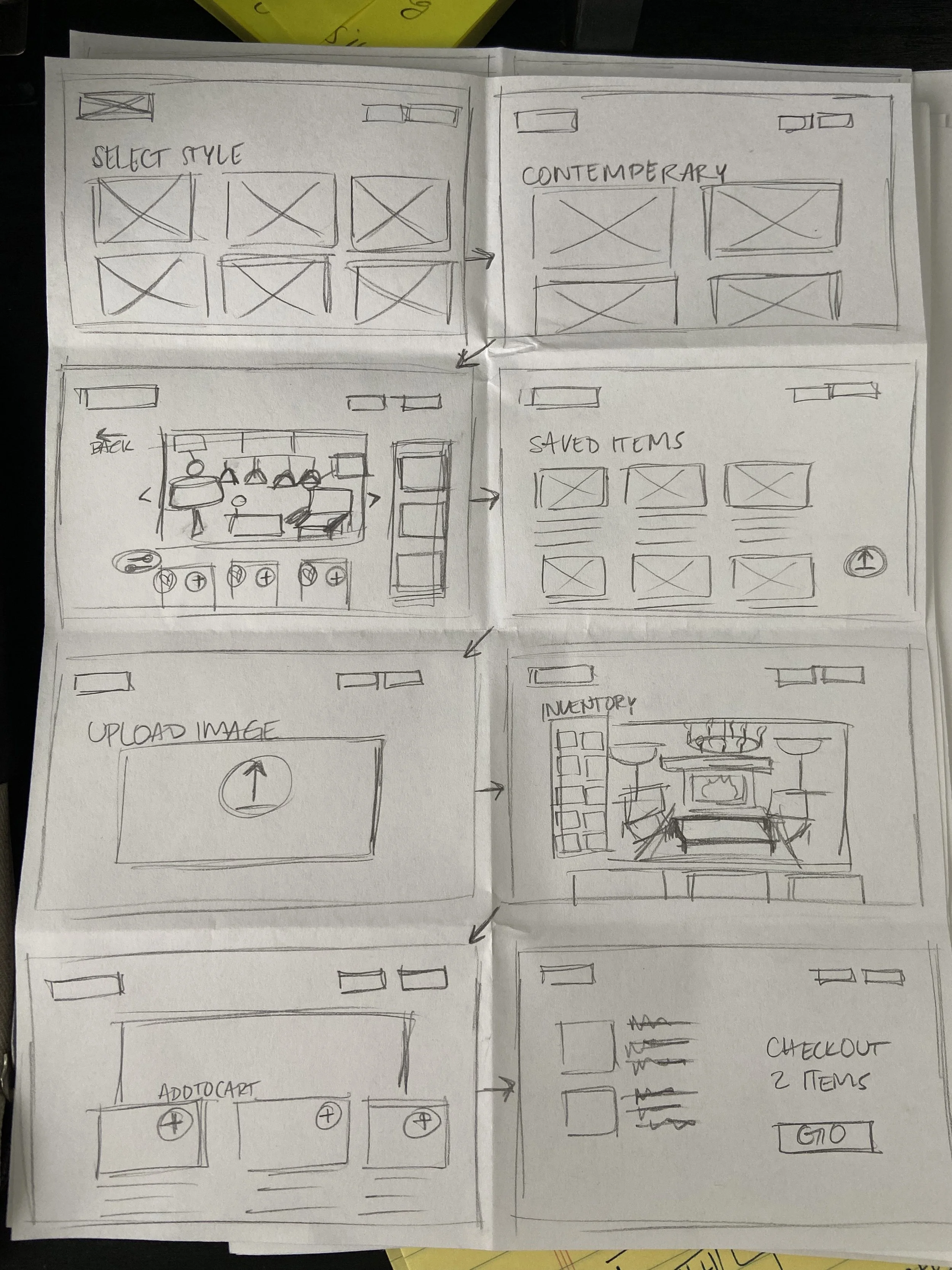
Screen Ideas
These screen ideas represent the 3 step process. Each element of each screen is aimed to make the user feel more confident when shopping for home decor.
User is able to pick out desired style
User is able to favorite pieces (within budget)
User is able to visualize pieces in own home and can prioritize which items best fit their space.
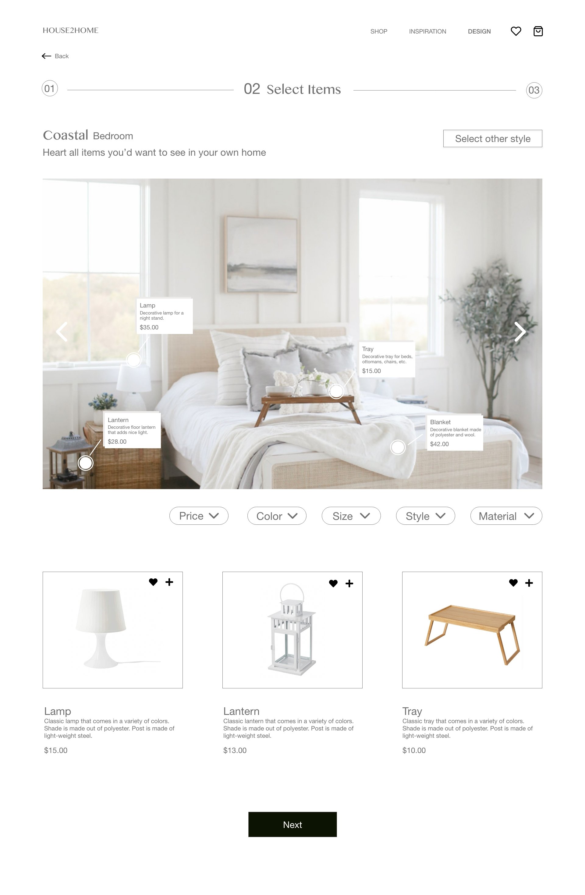
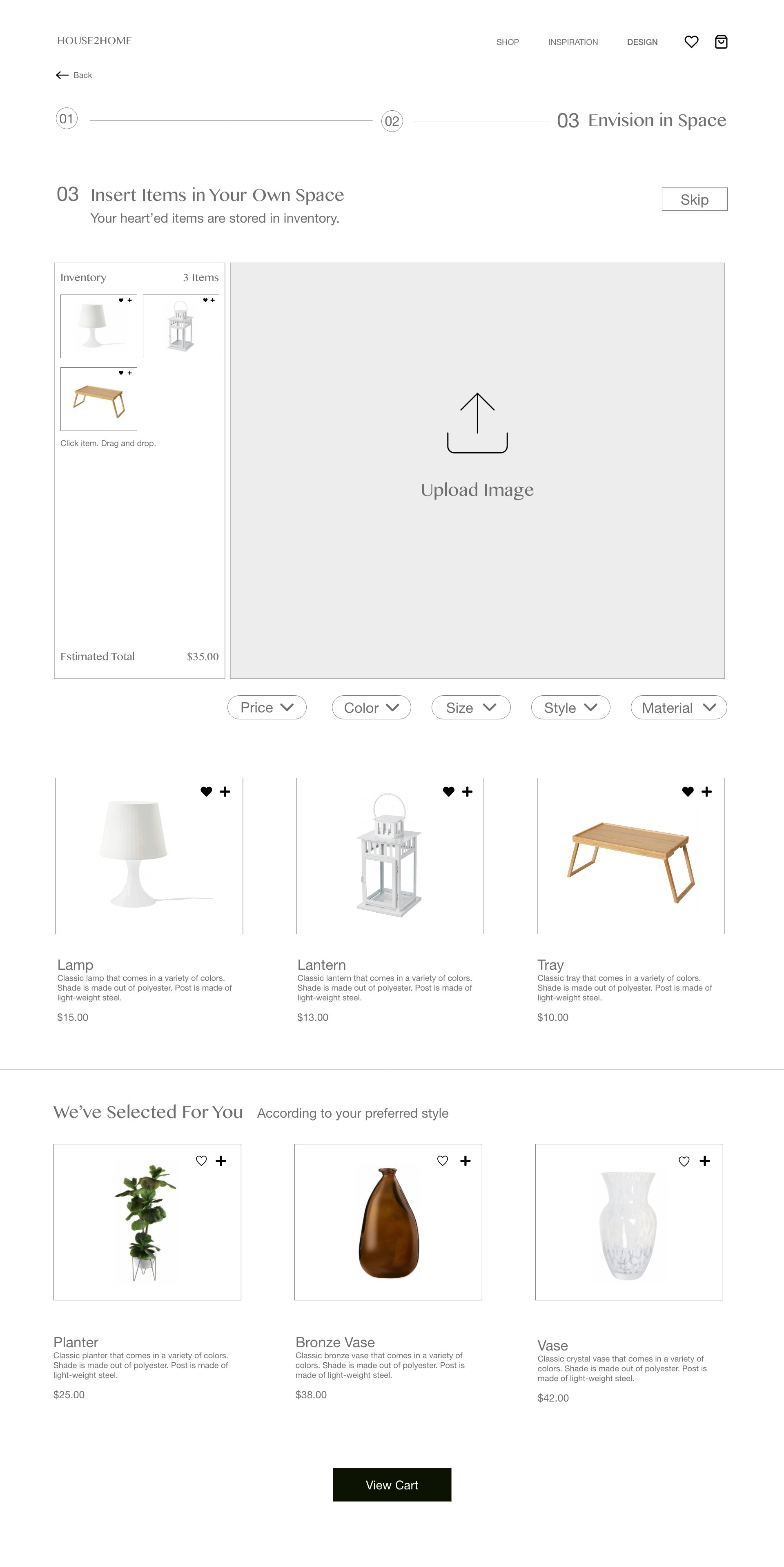
High Fidelity + Prototyping


Usability Testing
I tested this product with 5 participants, ages ranging from 23-69. (New homeowners are not always limited to younger populations despite the vast majority). From my testing, I was able to gain a robust understanding of specific usability issues.
Distinct Patterns:
Not enough distinction between favorite and add to cart- The second step of the design funnel felt a bit ambiguous to users, which was favoriting items they might like to see in their own home. The previous design had 2 microinteractions side by side (favorite and add to cart), not giving enough direction as to what the user should be doing while on the page. To display visual hierarchy and establish the difference in actions, I moved the “add to cart” button below the image so it aligns with the description and left the “favorite” action in the upper right hand corner of the image. This displays 2 separate actions in different locations so the user can focus on each of them one at a time.
Getting disoriented in the design funnel- Although the design was aimed to be minimalistic and intuitive, labels did not provide enough context for users. Some of the older participants lost their place in the midst of the design funnel. They were unsure of what “step” they were one (1,2, or 3.) I added labels to the remaining steps to add context and allow users to gauge where they are at along the process, as well as add color to the current “step” they’re on. Moreover, in order to keep users engaged and remain in the design funnel, I chose to eliminate some of the tabs in the navigation/menu bar to completely deter users from exploring any other content from the site.
Revising copy and CTAs- Copy is critical and allows users’ expectations to be met essentially. I readjusted copy that might have confused users especially regarding CTAs. “Next” was not contextual enough and did not allow users to fully understand the repercussion of their action if they were to click the button. By relabeling CTA titles, I can ensure users will feel confident and understand the results of their actions.


Takeaways
It was fun putting the design process to work in a different UX methodology/lifecycle. I was pleasantly surprised at how fast I was able to come up with a solution for the problem space. What I’m looking forward to is collaborating with other designers while working through fast, iterative sprints that can drive massive change in a small amount of time.